
In the Views side panel found on the left side of your dashboard, you’ll see 4 options – Pages, Selectors, Audiences, and Variants. Once clicked on, each one will display a correlation graph and table presenting each view’s performance across numerous KPI’s.
Graph
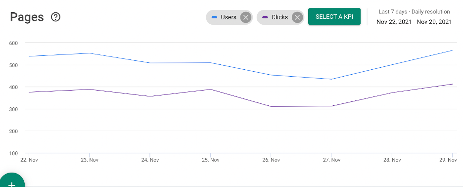
Your graph essentially displays the information in your table, including any filters you’ve added. Your default graph will show Users and Clicks which you can delete by clicking the X next to their name, and you can add any other KPI to the graph by clicking, Select a KPI, and selecting which KPI(s) you’d like displayed on your graph.
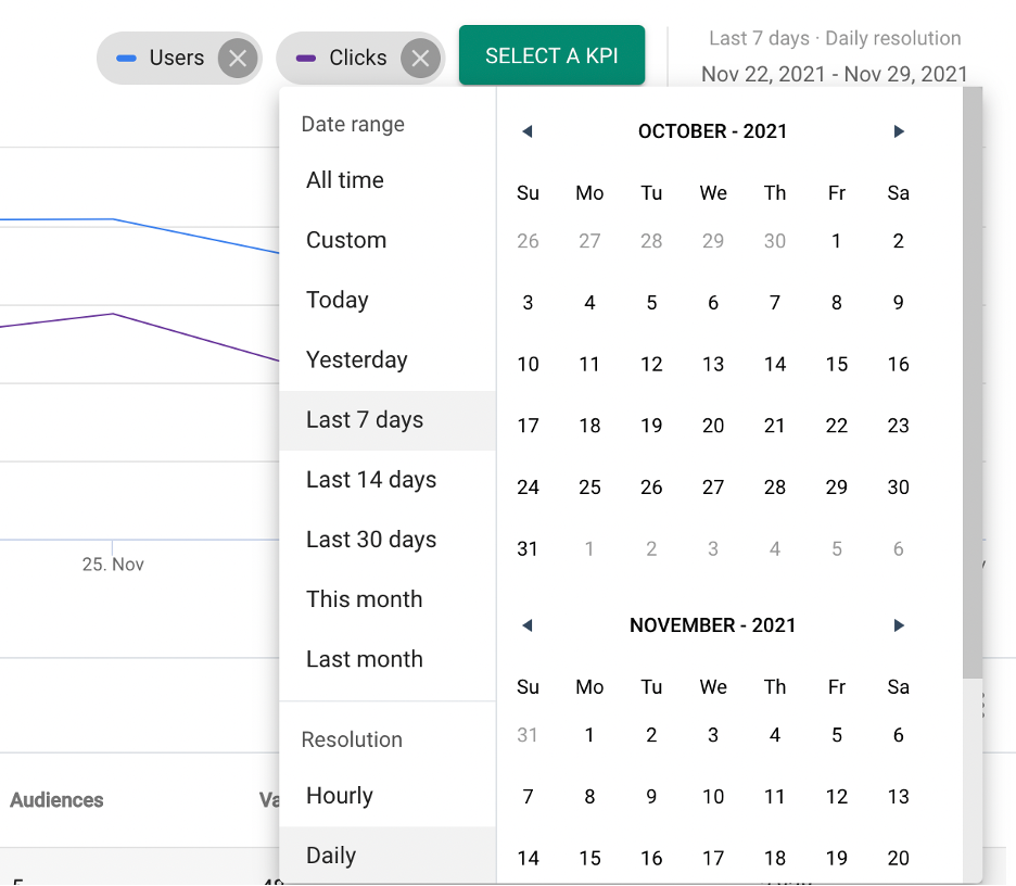
To the right of where you can select the KPIs displayed on your graph, you have your calendar, where you can select any time frame for your graph and table. The default will always show you the last 7 days, but you can always change it by simply clicking on the dates, and you’ll see this pop-up with time frame options. You can choose from any of the suggested time frames on the left side or manually select your time frames using the calendar itself. On the bottom left side under Resolution, select if you’d like your graph to be displayed in an hourly or daily manner.
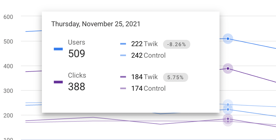
If you hover over any point on the graph, you’re able to see the number value of your selected KPIs at any point on the graph, and see how the number splits up between twik and control. Note that twik and control together might not add up the total that you’ll see on the left, and that is because not all users are in either twik or control. So for example, here I have 30 clicks that are not shown in twik or in control, meaning these 30 clicks were made by users that were not included in the twik group nor the control group.