
Table
The far left column on your table defines the different pages/variants/selectors/audiences of or on your site. At the top of your table, you’ll see a green toggle where you can choose to view both enabled and disabled views, or only the views that are currently enabled. If you choose not to adjust it, the default will only present enabled views in the table. For example, if you’re looking at your Pages table, the table by default will only show the pages that are currently enabled.
The remaining columns consist of different KPI’s that show performance across different views, depending on what table you’re looking at – Pages, Selectors, Audiences, Variants.
The KPI’s in each table include:
- Selectors – number of active selectors on your site
- Audiences – number of active audiences on you site
- Variants – number of variants on your site
- Pages – number of pages on your site
- Page URL – This KPI will only appear on the table in the Page view
- Users – total number of users who visited your site in the selected time frame
- Pageviews – total number of views of all of your domain’s pages in the selected time frame
- Clicks – total number of users who clicked somewhere on the site in the selected time frame
- CTR – Click through rate – the rate
- Add to Cart – the amount of users that added at least one item to their cart in the selected time frame (note that this KPI will likely show 0 for sites that are not e-commerce)
- Add to Cart Ratio – the percentage of users that added at least one item to their cart out of the total users that visited the site in the selected time frame (note that this KPI will likely show 0% for sites that are not e-commerce)
- Submissions – the number of those that submit a form (note that the value for this KPI will show 0 if you have no forms on your website)
- Submission Rate – the percentage of people that submit a form out of the total number of users in the selected time frame)
- Registrations – number of those who registered (note that the value for this KPI will show 0% if you have no forms on your website)
- Registration ratio – the percentage of those who registered out of the total users that visited the site in the selected time frame
- Login – the number of people who have logged in to your site in the selected time frame
- Login Ratio – the percentage of users who logged in out of the total number of users who entered your site in the selected time frame
- Newsletters – The number of users that subscribed to your newsletter (if you have one) in the selected time frame
- Newsletters ratio – the percentage of users who subscribed to your newsletter out of the total number of who users who entered the site in the selected time frame
- Revenue – Total revenue in the selected time frame. This KPI is only displayed for those with a Shopify store.
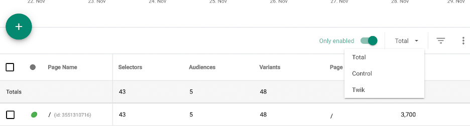
Next to the Only enabled toggle, you’ll see a drop down menu where you can filter the KPIs presented in the table by group. The default is always total, meaning users in the twik group, control group, and remaining users that are in neither twik nor control.
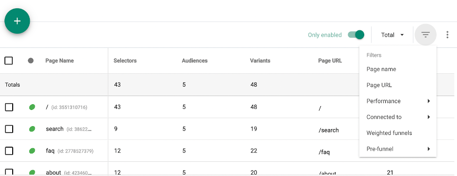
Here you have the ability to filter your table by any of the KPIs mentioned above, along with additional filtration options. Under Performance, you can filter any of the KPIs and under Connected to, you can choose to filter by any of your active audiences, variants, selectors, and pages. Make sure to click Apply at the top right corner to save changes.
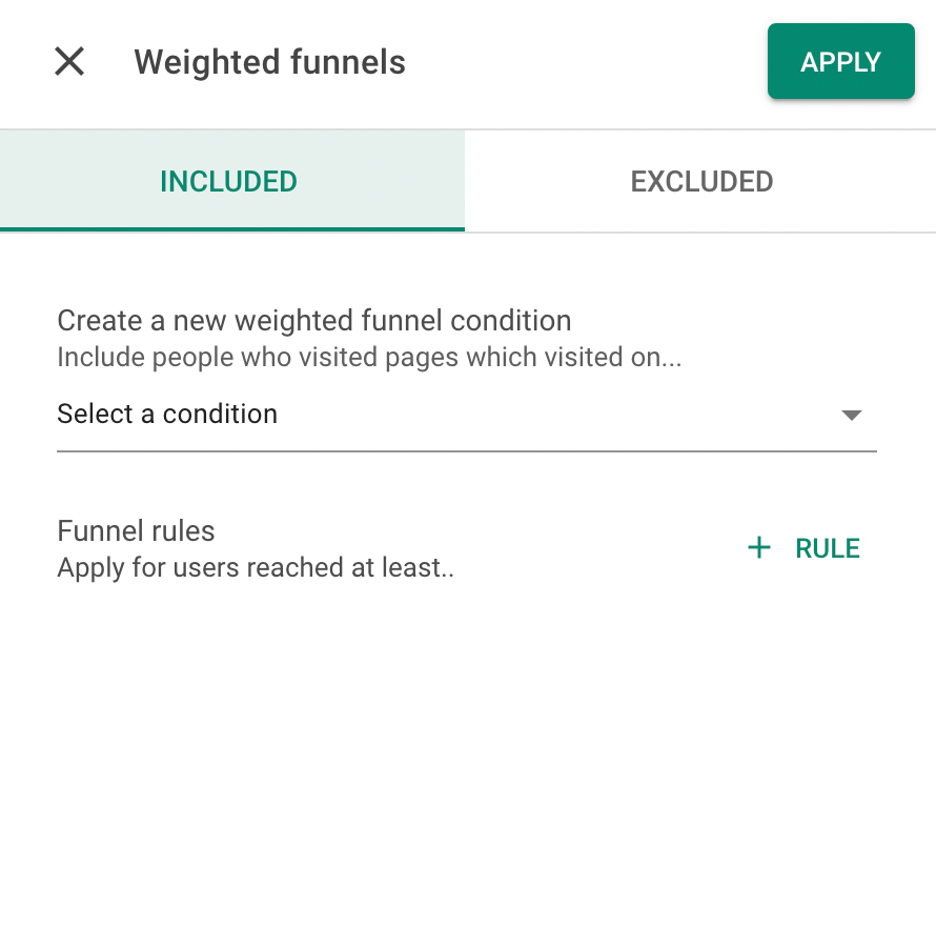
If you’d like to filter by weighted funnel, click Weighted Funnel in the filtration section and this right sidebar should pop up. Here, you can filter your table based on 1 or more conditions of your choice in the dropdown menu where it says, select a condition.
Below that, add your funnel rules. You can choose between retention, engagement, or conversion, and create an if or and filter, so that it will apply to your table. You’re also able to add multiple rules to your weighted funnels.
Note that when the sidebar opens to add your conditions and rules, you can add that in either the Included or Excluded tab. If you add it in the Included tab, your table will filter everything including the condition and rule(s) you set, and if you add it in the Excluded tab, your table will display everything excluding the condition and rule(s) you specified in this tab. Make sure to click Apply at the top right corner to save changes.
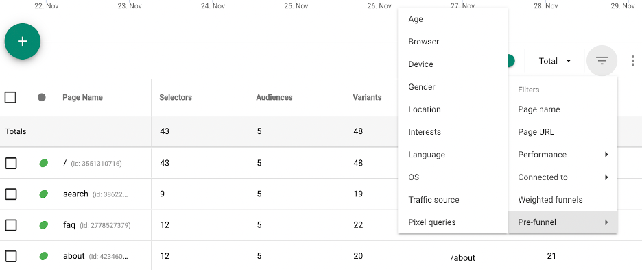
You can also filter your table using a pre-funnel, where you can choose to include or exclude based on age, browser, device, gender, location, language, operating system, traffic source, or pixel queries. when you click on one, you’re given a few options to choose from, and choose whether you’d like to include these filters, or exclude these filters. While most of these pre-funnels are quite self explanatory, it’s important to note that OS, refers to operating systems like Mac or Windows to give a few examples. Pixel queries refer to different accounts users may have on different sites. So for example, I can include or exclude those who have an Expedia account, and my table will then show my KPIs based on that condition. If you choose more than one pixel query, then you have to specify if you’d like users with both domains to show in your table, or users with either of the domains you’ve selected. You can do this in the drop down menu where it says, match any of the pixels in the pixel queries sidebar. Make sure to click Apply at the top right corner to save changes.
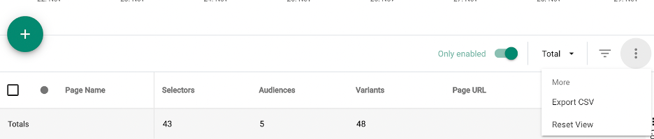
The last part of your table, to the right of the filtration icon, you can export your table or Reset View which will reset your table and eliminate any filters you added.
Graph
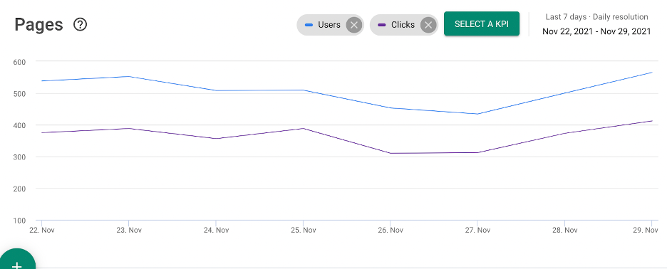
Your graph essentially displays the information in your table, including any filters you’ve added. Your default graph will show Users and Clicks which you can delete by clicking the X next to their name, and you can add any other KPI to the graph by clicking, Select a KPI, and selecting which KPI(s) you’d like displayed on your graph.
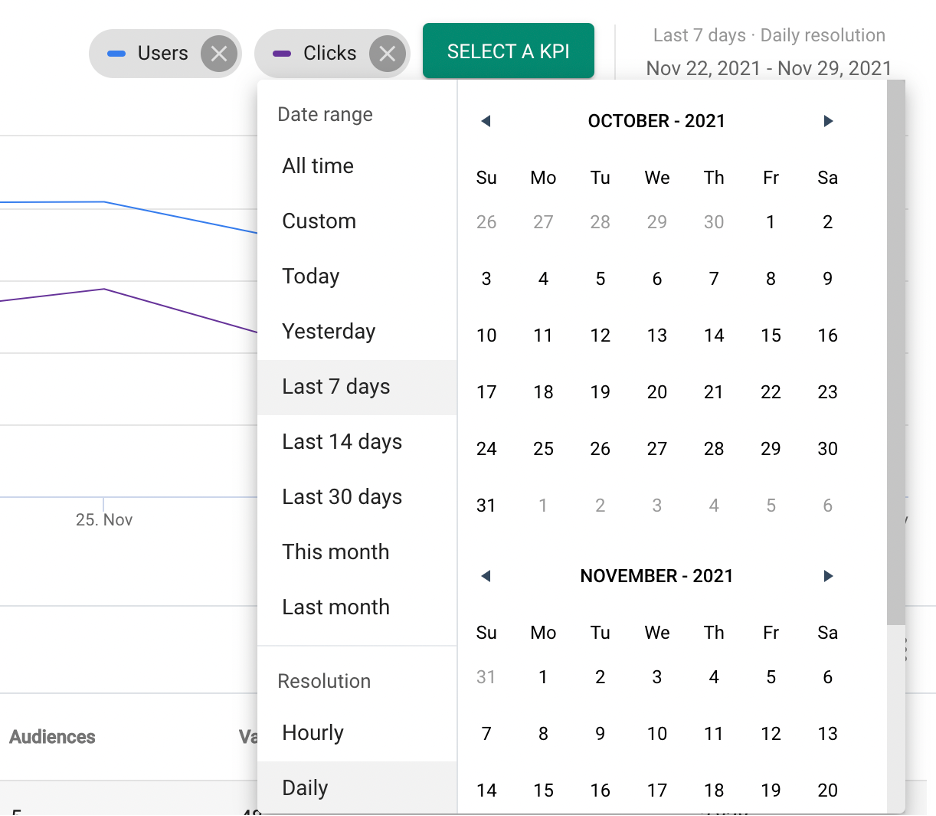
To the right of where you can select the KPIs displayed on your graph, you have your calendar, where you can select any time frame for your graph and table. The default will always show you the last 7 days, but you can always change it by simply clicking on the dates, and you’ll see this pop-up with time frame options. You can choose from any of the suggested time frames on the left side or manually select your time frames using the calendar itself. On the bottom left side under Resolution, select if you’d like your graph to be displayed in an hourly or daily manner.
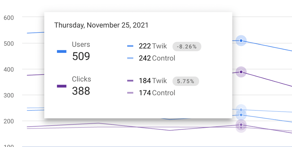
If you hover over any point on the graph, you’re able to see the number value of your selected KPIs at any point on the graph, and see how the number splits up between twik and control. Note that twik and control together might not add up the total that you’ll see on the left, and that is because not all users are in either twik or control. So for example, here I have 30 clicks that are not shown in twik or in control, meaning these 30 clicks were made by users that were not included in the twik group nor the control group.